Bloodline 125
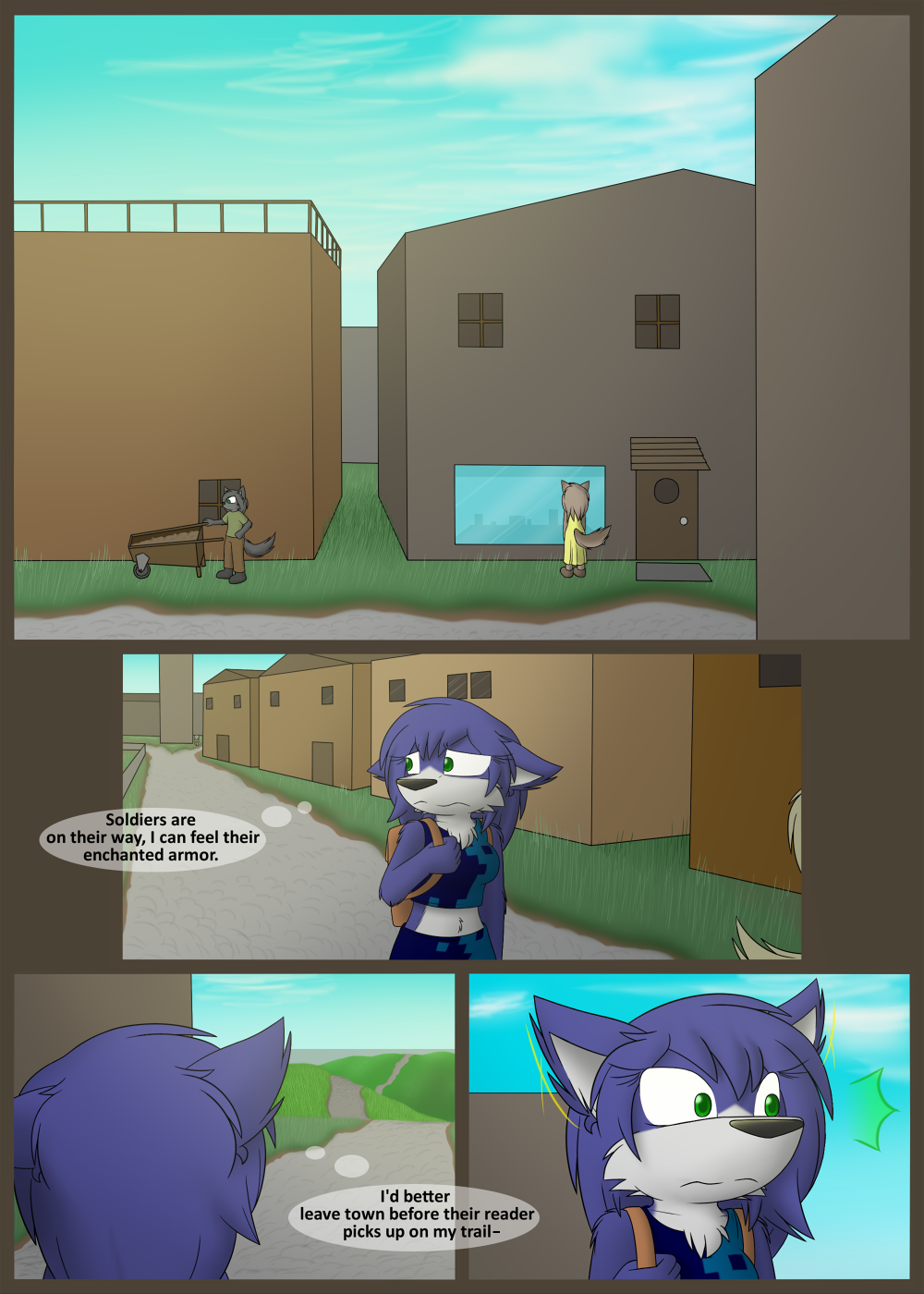
Onward to adventure! Still working on my daytime lighting, I’m a little more pleased with it this time.
Links section updated, Characters page updated, made the TWC voting pic pretty, and updated some things on Patreon. Feel free to explore ^^
Edit: another new incentive posted! http://topwebcomics.com/vote/15334/default.aspx
Topwebcomics has been one of the most successful ways of bringing in new readers! If you take the time to vote often, it really helps out a lot. Enjoy the incentive!


I don’t know about this one. It just feels like there’s a page missing between this one and the last. Anybody getting that too?
Also your sky looks fine I just think it’s a bit too aqua
I figured it out the colors fine but the sky is takeing up too much space makeing the color appeare uniform even with the clouds breaking up the sky. In other words pannals 2 and 3 are good but the sky in 1 and 4 look too as I said aqua. The contrast between the landscape and the sky is good. I have compared yours to twokinds recent few comics and the sky is broken up between different color backgrounds from pannal to pannal so it doesn’t appeare too blue or another color. I know that’s not a fair comparison but it’s good to look and learn from other comics. And keep your style the same throughout background foreground and characters. Otherwise good work you’ve came a long way.
Thanks for the feedback, I think a deeper blue will fix the problem. The sky can be pretty blue, but this isn’t quite the right hue.
Good to hear you’re enjoying the art otherwise!
Hey, w0lfmare,
a village full of buildings just asked me for a bit more testure,
maybe you can show the materials or the building style…
One last thing Ember in pannals 2 and 3 looks far too detaild copared to the background she sticks out like a sore thumb and generally looks like she doesn’t belong there’s just too much contrast between her and the background
It’s panel. PANEL. Get your spelling straight, goddammit!
Sorry about my terrible spelling but I think my point got across all the same. I know it bothers some people but we all can’t be english majors and for that I am truly sorry.
Furminium: Yeah I wish I had more time to put into the buildings on this page, they ended up looking a little plain.
Alex: Well Ember herself sticks out like a sore thumb in this town of browns and greys, I’m not so sure it’s a question of detail =P
Your right… Maybe it just the contrast in color that’s giving off that vibe. I don’t know but we will see if your other characters look that way too.
Sorry I hope you don’t think I’m criticizing you too much I really like your comic and It looks great from what it began as. Its just that I’m a little nit picky
I like to think that as long as I can find problems with my art, I can continue improving. I can’t speak for all artists, but I’m fine with the criticism ^^
I can hear the Metal Gear ” ! ” in the last panel.
hah same XD